 I’ve been doing quite a bit of work over the last month, but I’ve neglected to post any updates on my progress. In honor of today being Tabletop Day, I’ll get back to writing updates. Rather than overwhelm you with a single post on all the changes and new features, I’ll break them down and post each individually as I write them up.
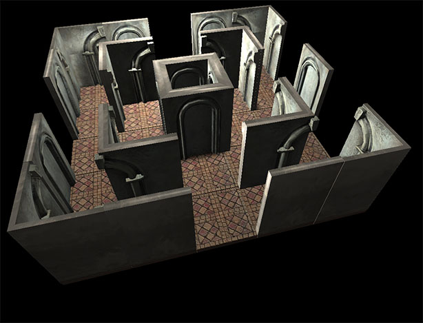
The first change was in the map structure itself. Originally I was storing the map in a rather naive fashion, knowing all along I would have to update it at some point. The original method stored the grid squares as either open or as a wall. This worked fine for test purposes, and made maps much easier to mockup. Unfortunately, anyone who’s ever mapped a dungeon during play realizes that the walls are most frequently represented as a line along the grid lines—not in a square, but between them.
To represent this, I have split the walls, storing half in each square. A wall running horizontally, for example, would be stored as a wall running east-west with the north facing half in the upper squares and the south facing half in the lower squares. As line-of-sight is coming on line this has the added benefit of only rendering the side of the wall that is visible.
What, on the surface, is a rather simple change in representation has the knock-on effect of requiring significant additional artwork and the added logic for determining which wall piece is necessary: currently it requires twelve wall pieces when you account for straight walls, end caps, inside corner and outside corners. Thirteen pieces if you include that I have two middle wall pieces to create a 10′ span of wall with 5′ squares.
Next up, miniatures.

Interesting. And it gives you the option to put vines on one side of a wall and running water on the other. Neat.
Switching styles on opposite sides of the wall was one of the factors that encouraged me to go in that direction. If you’re in the tavern, you’d expect the inside and outside of walls to be representative of that.